My Role: 1- Using research to identify the technological needs of two sets of users- museum professionals and museum goers. 2- Using this research to build up a prototype.
Tools I Used: Figma, Sketch, Miro, Adobe Creative Suite, Google Forms, Google Sheets, Keynote
Marker.fyi
A One-Stop-Shop for Museums To Connect Digital Stories To Their Exhibitions
• Upload Your Text, Video, Audio, or Whatever You Like to MARKER.FYI
• We Send You an NFC Tag To Stick In An Exhibition or Wherever You Like
• Visitors Can Tap Their Phones Against The Tag To Connect To Your Online Content (Same Tech. As Apple Pay)

Why Museums?
“ In the US, gallery spaces receive 850 million visitors per year, which is more than most sports venues. According to the American Alliance of Museums, this represents around $21 billion in economic activity.”
- Manuel Charr, museumnext.com
“As we emerge slowly and cautiously from the challenges of the pandemic, museums have decisions to make about which horses they will be backing in the technology space over the coming months and years.”
- Tim Deakin, museumnext.com
There are over 35,000 museums in the USA, Marker.fyi wants to be the go to for hosting and printing NFC tags

Problem Statement:
Museums seek new ways to connect exhibitions in the real world with digital storytelling so that they can broaden the visitors engagement, find new audiences, create new kinds of accessibility and make the museum an integral part of their communities.
How Might We?…
…become an easy and affordable digital choice for museums struggling with new technologies?
...create a digital complement to real world experiences?
...create accessibility-minded exhibitions?
...explore new ways for audiences to interact with a museum’s archives?

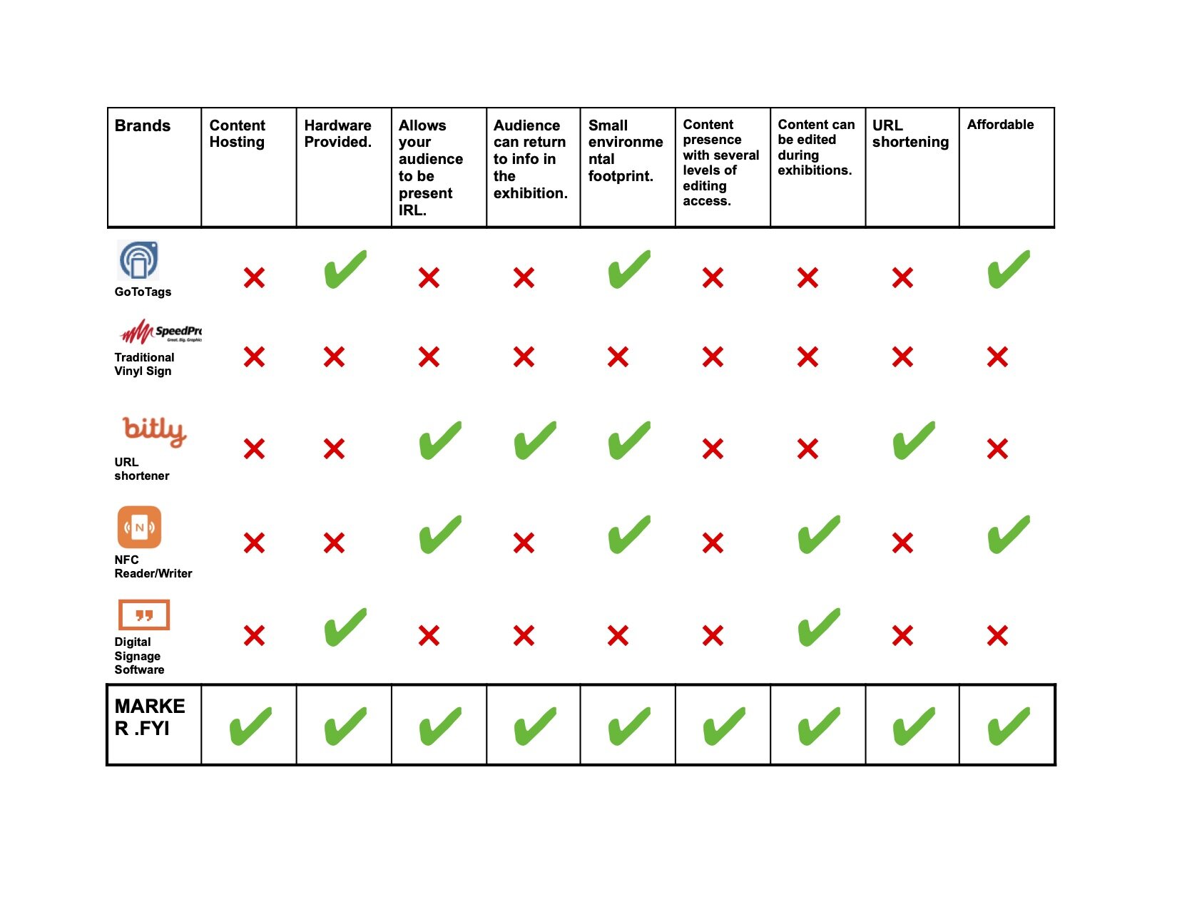
Competative Analysis
Major Take-Aways:
• Many options for digital signage exist, but MARKERs approach has no direct competitor.
• Several NFC tag makers, but they only offer very ‘diy’ service.
• Surprisingly, the clearest competition comes from vinyl signage. However, vinyl is expensive, bad for the environment and cannot be altered once installed.
• QR codes are a clear competitor, with much less stealth applications. Perhaps MARKER should offer these as well.

User Interview Methodology:
• Interview 5 designers and builders of exhibitions from different geographical locations.
• Focus on exhisting attitudes towards museums

Interview Takeaways
High Level Concern
•Are museums considered crucial?
•What’s the difference between a popular exhibition (good) and populist (bad)?
•Do audiences feel alienated by museums?
High Level Goals
•Expanding the Audience
•Social Responsibility
•Getting People to Engage with Each Other
•Creating Return Visitors
Other Learnings
•Analytics seem to not be a major need for museums
Feature Prioritization
1.A Clear and Easy to Use Editor for Museums Will Create The Most Value for The User
2.An Informational Onboarding to Explain The Service in the Clearest Way Possible

Revised Problem Statement:
Museums seek ways to increase the engagement of their audiences in real-world, real-time ideas, experiences and communities. They seek opportunities to utilize technology to support this goal and not eclipse it.
…with some data points gathered, it was time to work on what the user wanted and how this could translate into good design, I started with a persona:
I then sketched some ideas about how nature could be incorporated as a kind of stand in for the “real world” that my users mentioned in their interviews…
…I created the first userflow…
…and some early wireframes…
…and began usability testing:
Flow 1
Create an Account.
Flow 2
Enter Your MARKER gallery and add a “new MARKER” to your existing Gallery.
Testing Take Aways
“Sign Up” Test
•Do You Need to Put A Card On File For The Free Option?
•No Back Button Anywhere During Sign Up
•Confirmation of Account Creation Should be Clearer
“Create A New MARKER” Test
•The Labeling of the “Gallery” and “Editor Should Be Moved Closer To That Function
•Label Should Be Under “New MARKER” To Make Finding It Easier
•Confirmation of MARKER Creation Should Be Clearer
•A “Save” button Would Make Users Feel More Secure Even If It Isn’t Totally Necessary
Other Learnings
•Create a Success Screen During Usability Tests
•Focus On The Thing That Creates the Most Value When Testing
Next Steps
•Share Research and UX Work With Stakeholders
•Implement Findings From Usability Tests
•Push The Onboarding/Animation Idea Further
•Keep Iterating!!!


