My Role: Determining the app’s key functionality through interviews and analysis. Making the most minimal tweaks to create a smoother user experience.
Tools I Used: Figma, Miro, Adobe Creative Suite
AllTrials - An AllTrails Case Study
I wanted to find a hike, instead I found a problem.
Hypothesis
Users are looking for a tool to get them into nature and away from their screens. AllTrails offers good functionality, however, on my way out the door I couldn’t intuitively find any of it. I went for a hike I already knew about, came home, sat down and took a closer look.
User Interview Methodology
I interviewed app users about their existing attitudes. My inquiries focused mainly around three themes:
1.What need is being fulfilled by AllTrails? Where are they interacting with AllTrails throughout the process of hiking?... before, during and after a hike.
2.What function feels essential from AllTrails throughout this hiking process?
3.Where are there pain points when interacting with AllTrails?
User Interview Takeaways
The users interacted with AllTrails very differently throughout the stages of their hike days. There was also variation in use that depended on their hiking experience level.
1.Generally users open AllTrails first to research hikes. They then use the coordinates link to navigate to the trailhead. They often download the map at some point in this process, and with the exception of one user, do not use the app after the hike. They sometimes use other apps to compliment this experience, like the camera app, strava, etc...
2.The most vital features for users are the map function and the research function (with an emphasis on the most recent reviews).
3.It is frustrating when maps won't load even after being downloaded at the trailhead, the distances of hikes are inaccurate, the single hike AllTrails recommends does not correspond with the actual amount of options at a trailhead , and finally, “the interface is like airbnb” - the list on your profile’s landing page is too dense and often not showing you anything relevant.

Redesigning in App Priorities
My Research Dictated That The Explore Page Was The Most Important Interface in the App, So I That is Where I Started
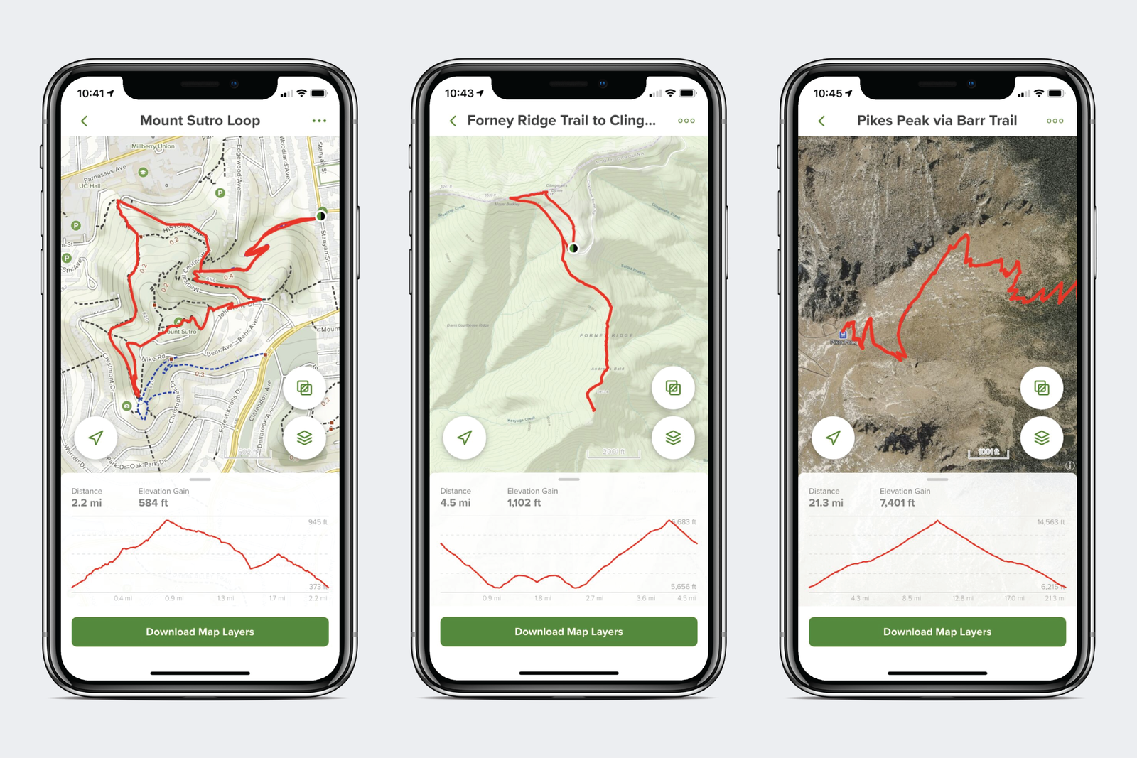
Current User Interface Design
AllTrails Style Guide
The New AllTrails
I utilized my research to change the interface in subtle but important ways.
• I added a google maps link readily available on each hike.
• I added a drop down menu at the top next to the user name to hold less important features including your user profile.
• I cleaned up the bottom menu to reflect the three stages of the hike. The “before”, “during” and “after”.
• I changed the section headings:
The “downloaded maps” heading is so a user can quickly return to beloved hikes.
The “parks, mountains and greenways near you” heading allows users to explore a broader range of available hikes near them, instead of a single, often idiosyncratic listing.


